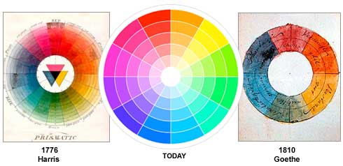
The Colour Wheel:
 |
| colormatters.com |
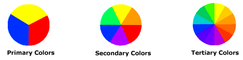
There are different categories of colour, based on the above colour wheel.
 |
| colormatters.com |
Primary Colours: Red, yellow, and blue. These are the three pigment colours that can't be mixed or formed by combinations of any other colours. These are the three colours that all other colours are derived from.
Secondary Colours: Green, orange, and purple. These are the colours that form as a result of mixing primary colours.
Tertiary Colours: Yellow-orange, red-orange, red-purple, blue-purple, blue-green, and yellow-green. These colours are the combination of a primary colour and a secondary colour. That is why the hue is a two word name.
Colour Harmony:
A harmony is a pleasing arrangement of parts. This can apply to many subjects: music, poetry, colour, etc.
In regards to colours, harmony is something that is visually pleasing. It engages the viewer and it creates an inner sense of order, a balance in the visual experience. If something is not in harmony, it is either dull or chaotic. At one extreme is a visual experience that is so bland that the viewer is not engaged. The human brain will reject under-stimulating information. At the other extreme, is a visual experience that is so overdone, so chaotic that the viewer can't stand to look at it. The human brain rejects what it cannot organise, what it cannot understand. Colour harmony delivers both visual interest and a sense of order.
Extreme visual unity leads to under-stimulation, while extreme complexity leads to over-stimulation. Harmony is a dynamic equilibrium.
Some Basic Formulas for Colour Harmony:
There are many theories for colour harmony, but these are some of the basics:
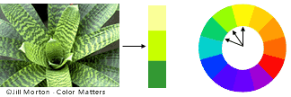
1. A colour scheme based on analogous colours.
 |
| colormatters.com |
Analogous colours: three adjacent colours on a 12 part colour wheel. There is normally one dominant colour among the three.
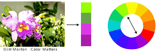
2. A colour scheme based on complementary colours.
 |
| colormatters.com |
Complementary colours: Colours that are directly opposite each other on the colour wheel, such as red-purple and yellow-green. Opposing colours create maximum contrast and maximum stability.
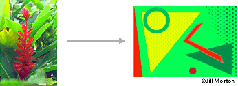
3. A colour scheme based on nature.
 |
| colormatters.com |
Nature is a great place to find colour harmony. As seen in the picture above, the three colours (red, yellow, and green) create a balanced design, regardless of whether this combination fits into a technical formula for colour harmony.
Colour Context:
Colour context is a very complex area of colour theory. Colour context is the name given to the way colours behave in relation to other colours and shapes. Different background colours can have a big effect on any one colour, as can be seen below:
 |
| colormatters.com |
Red seems more brilliant against a black background, and slightly more dull against a white background. Against an orange background, red seems more lifeless, and drowned out; in contrast with the blue-green colour, it exhibits brilliance.
Different Readings of the Same Colour:
 |
| colormatters.com |
Colours can appear vastly different, just by changing the background colour. In the above image, the small purple rectangle on the left appears to have a red-purple tinge when compared to the small purple rectangle on the right. In reality, they are both the same colour, as evidence by the image below. In this way, three colours can be perceived as four colours.
| colormatters.com |
Observing the effects colours have on each other is the starting point for understanding the relativity of colour. The relationship of values, saturations and the warmth or coolness of respective hues can cause noticeable differences in out perception of colour.
 |
| tigercolor.com |
The colour circle can be divided into warm and cool colours.
Warm colours are vivid and energetic, and tend to advance in space.
Cool colours give an impression of calm, and create a soothing impression.
Tints, Shades, and Tones:
Tint: when a colour is made lighter, by adding white.
 |
| tigercolor.com |
Shade: when a colour is made darker, by adding black.
 |
| tigercolor.com |
Tone: when gray is added to a colour.
 |
| tigercolor.com |
The Meanings of Colours:
Colours are often associated with specific emotions. In this section I will explore which emotions are typically connected to which colours. Some colours have different meanings in different countries and cultures, but I will focus mainly on a more generalised scale.
Red:
Red is often seen as a colour of extremes.
Associated with: Love, passion, seduction, violence, danger, anger, adventure.
Yellow:
Yellow is the colour that catches the eye more than most.
Associated with: happiness, optimism, enlightenment, creativity, sunshine, warmth, spring.
Blue:
Blue is a colour that has many meanings, depending on the shade used.
Dark blue is associated with: trust, dignity, intelligence, authority.
Bright blue is associated with: cleanliness, strength, dependability, coolness.
Light (sky) blue is associated with: peace, serenity, ethereal, spiritual, infinity.
Blue can, however, also often be associated with depression, and sadness in American culture. This is a good example of how colour symbolism can evolve in different countries.
Green:
The colour of nature and the environment.
Associated with: growth, rebirth, fertility, nature.
Orange:
Associated with: energy, vitality, cheer, excitement, adventure, warmth, good health.
============================
Now that I have done some colour research, my next task is to actually experiment with colours to see how it affects an image.
No comments:
Post a Comment