Thursday, 14 August 2014

Research - Perspective

One of the essential tools in an artist's kit is a knowledge and understanding of perspective drawing. Linear perspective deals with the organisation of shapes in space, while aerial perspective deals with the atmospheric effects on tones and colours.


Linear and Aerial Perspective:

http://www.artyfactory.com/perspective_drawing/perspective_index.html

http://www.artyfactory.com/perspective_drawing/perspective_index.html

The above images show the use of both aerial and linear perspective to create the illusion of three dimensions on a two dimensional plane. The coloured image shows how colours become more pale, and how the tones become weaker as they get seemingly increasingly further away. The black and white image shows how objects can be arranged to make a two dimensional image seem like it has depth and distance.


The Picture Plane:

http://www.artyfactory.com/perspective_drawing/perspective_1.html

It is easy to draw a shape that is parallel to the picture plane (the flat two dimensional surface on which we draw or project an image in perspective). The task becomes more complicated when a shape is drawn at an angle to the picture plane. The picture below illustrates how different a shape can be when it is drawn at different angles in relation to the picture plane:

http://www.artyfactory.com/perspective_drawing/perspective_1.html


The Horizon and Eye Level:

When constructing a perspective drawing, the horizon, or eye level, is used to create images that make good visual sense to the viewer. If you compare the two images below, the first image uses the horizon to suggest that the people are standing on the same plane, and are the same height. Conversely, the people in the second image are drawn the same size as before, but their eye levels no longer relate to the eye level of the picture, causing the scale of the people to become confused.

http://www.artyfactory.com/perspective_drawing/perspective_2.html

http://www.artyfactory.com/perspective_drawing/perspective_2.html

Vanishing Points:


http://www.artyfactory.com/perspective_drawing/perspective_3.html

http://www.artyfactory.com/perspective_drawing/perspective_3.html

The vanishing point is the part of the image in which parallel lines seem to converge and disappear. Vanishing points are used to demonstrate the simplest form of perspective drawing: One Point Perspective.


One Point Perspective:


http://www.artyfactory.com/perspective_drawing/perspective_3.html

http://www.artyfactory.com/perspective_drawing/perspective_3.html

The orthogonal lines (red), are drawn parallel to the ground plane, and move progressively away from the picture plane. These lines always seem like they join together at a vanishing point on the eye level.

The transversal lines (green), are always drawn at 90 degrees to the orthogonal lines. These lines are parallel to both each other and to the picture plane. They are the lines that make up the furthest and nearest edges of a rectangle as it recedes from view.


Two Point Perspective:


http://www.artyfactory.com/perspective_drawing/perspective_4.html

http://www.artyfactory.com/perspective_drawing/perspective_4.html

Two point perspective makes use of two sets of orthogonal lines, and two vanishing points to draw objects.There aren't any planes that are parallel to the picture plane in the image above, but the transversal lines are still parallel to each other, and are at 90 degrees to the ground plane.

This type of perspective drawing is more complicated, because the second vanishing point is normally not actually in the frame of the picture, as can be seen below. If both of the vanishing points are kept in the frame, then it tends to make the angles of the shape too foreshortened.

http://www.artyfactory.com/perspective_drawing/perspective_4.html


Three Point Perspective:


http://www.artyfactory.com/perspective_drawing/perspective_5.html

http://www.artyfactory.com/perspective_drawing/perspective_5.html

The most complex form of perspective drawing is the Three Point Perspective, which utilises three sets of orthogonal lines and vanishing points to draw objects. It is a useful method for drawing buildings that are being viewed from a low or high eye level. The image below uses a low eye level to give the illusion of a tall building.

http://www.artyfactory.com/perspective_drawing/perspective_5.html
The Three Point Perspective can also be used to give the impression that the viewer is looking down from a high viewpoint, using a high eye level.

http://www.artyfactory.com/perspective_drawing/perspective_5.html


Using a Central Eye Level:

The eye level of an image will have a big impact on the composition of the image.

http://www.artyfactory.com/perspective_drawing/perspective_8.html

http://www.artyfactory.com/perspective_drawing/perspective_8.html

A central eye level creates a balance between the sky and the foreground, in a landscape. It gives an image the impression that the objects in line with the eye level are at the same height as the viewer.


Using a High Eye Level:


http://www.artyfactory.com/perspective_drawing/perspective_9.html

http://www.artyfactory.com/perspective_drawing/perspective_9.html
If an image has a high eye level, it draws attention to the middle and distant areas of the image. Ordinarily, this isn't a suitable technique for the image above, but the rendered version has balanced the image by adding hills to the background. This breaks up the horizon, and links the background and foreground together.


Using a Low Eye Level:

Using a low eye level can create dramatic landscapes, by emphasising the height and power of objects in the foreground. This serves to make the viewer feel smaller, while adding to the power of the landscape.

http://www.artyfactory.com/perspective_drawing/perspective_10.html

http://www.artyfactory.com/perspective_drawing/perspective_10.html

This technique is useful for images in which the sky plays an important role in setting the mood of the scene, as it creates more space for the sky. Having a larger area of sky makes the sky have a bigger effect on the scale, tone, colour, and mood of an image. Examples can be seen below:


http://www.artyfactory.com/perspective_drawing/perspective_10.html

http://www.artyfactory.com/perspective_drawing/perspective_10.html

http://www.artyfactory.com/perspective_drawing/perspective_10.html

http://www.artyfactory.com/perspective_drawing/perspective_10.html

http://www.artyfactory.com/perspective_drawing/perspective_10.html


Monday, 7 July 2014

Quick Progress Update!

Sorry for the lack of blog posts in the last two weeks, I've been rushed off my feet getting things sorted for moving house: setting up new utilities, and drowning in a sea of paperwork and tenancy agreements!

I have been working on my dissertation, but it has all been in post-it form - I'm mapping out the storyboard on post-its so that it's easy to rearrange and change things before I start making final copies. When I'm happy with the storyboard layout I'll either scan the post-its up or sketch them straight onto the pc, making note of the changes I made in the post-it stage, and why I made those changes.

Keep watching this space!

Monday, 23 June 2014

Research: How to Create a Storyboard

A lot of the images in my final artefact will be set out in a storyboard, so I need to research the techniques that are used to create a storyboard, like the camera angles, and how they affect the mood of the scene.

What is a storyboard?

A storyboard is a method used in film or animation, to visually convey a story. Similar to a comic strip, a storyboard is laid out in a series of sequential sketches. Storyboards show what camera angles are being used, what characters are in the frame, and what the characters in the frame are doing or saying. A storyboard is a good way to draft a scene shot by shot, so that you can make changes easily, at an early stage, before production begins. The frames are normally sketched in a simple manner, just using basic outlines of shapes and backgrounds, and stick figures - there is no need for detail works of art at this stage.


Storyboard Language:

There are many terms used in storyboarding, to describe the camera angles, movement, and transitions between shots.

1. Camera.

Close-Up Shot. The camera is close to the subject, to focus on what they are saying, or to show facial expressions. With a character, this normally involves focusing on the shoulders and above.

Medium Close-Up Shot. The camera focuses on a single subject. With a character, this normally involves focusing on the waist and above.

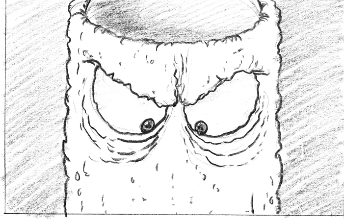
Extreme Close-Up Shot. The camera focuses on a single feature of the subject, i.e the mouth, a hand, etc. This serves to draw attention to it.

High Camera Angle. The camera looks down on the subject. This serves to make the subject seem small, weak, or unimportant. It can also be used to give the impression that the subject is being watched by a more powerful presence.

Level Camera Angle. The camera angle is even with the subject.

Wide Angle. The whole subject is shown, placed in context in their surroundings.

Long Shot/Extreme Wide Angle/Establishing Shot. The camera is far away from the subject. This serves to show a wider view of the subject's surroundings.

Over the Shoulder Shot. This shot is used to put the focus on the main subject, to show that what they are saying or doing is of higher importance than the secondary subject.

Low Camera Angle. The camera looks up at the subject. This serves to make the subject seem more powerful and important.

Point of View Shot. The camera mimics the vision of a character in the scene.

Reaction Shot. This can be a shot of someone looking off-screen. It can also be a shot of a person that is being spoken to, so that we can see their reactions.

Tilted (Dutch) Shot. The camera is at a tilted angle. It is used to give the feeling of unease, and makes the viewer feel off balance.

Two Shot. The camera shows more than one person, but shows them at the same angle/distance. This is used when a conversation is happening, between people whose actions/words are intended to be equally as important as each other.

Extreme Close-Up (brianlemay.com)

2. Movement.

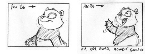
Pan. The camera moves steadily across from one part of a scene to another.

Tilt. The camera moves up or down, so that it can follow the action or the subject.

Track. The entire camera moves to follow a moving subject.

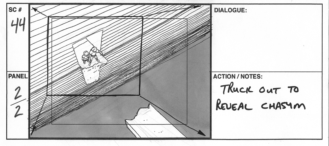
Zoom. The camera moves closer to the subject, or further away from the subject. Also known as "Truck". Zoom/Truck in is used to draw the viewer's attention towards something, and Zoom/Truck out is used to reveal something to the viewer that was initially hidden.

Reveal. The camera stays in place, but the subject moves through the frame during the shot.

Rack Focus. The camera has one subject in focus, and others out of focus, and then the focus changes to a different subject in the same scene.

Background Pan (brianlemay.com)
Truck Out (brianlemay.com)


3. Transitions.

Dissolve. The first shot fades out, while the next shot simultaneously fades in.

Fade Out. The scene gradually darkens, until the scene becomes black. Can be used at the end of a scene to imply that time has passed between scenes.

Fade In. A black scene gradually brightens, until the desired scene is visible.

Jump Cut. The view changes abruptly from one scene to another, or from one frame to another frame in the same scene. This is often used to disrupt the flow of time, or to make the scene seem more frantic, or chaotic.

Dissolve (brianlemay.com)
Fade to Black (brianlemay.com)


The 180 Degree Rule:

In Jennifer Albright's article, How to Make a Storyboard - Storyboard Lingo and Techniques, she talks about the "180 degree rule". This is a convention used to maintain visual acuity, and to stop the viewer from becoming disoriented. Consider the master shot shown below:

videomaker.com

The overhead shot shows an imaginary line drawn between the two subjects. Keeping the camera on the same side of this line is desirable, for both the viewer and the editing staff.

videomaker.com

The scene above keeps the 180 degree rule in mind. The close up shots of each subject are consistent with the way they are facing in the master shot. Here is what the shot will look like if the 180 degree rule is broken:

videomaker.com

This shot is disorientating, because they are now seemingly facing the same direction, rather than facing each other. Sticking to the 180 degree rule will save a lot of time later in the editing room.


Time to get sketching!


Tuesday, 10 June 2014

Research - Colours and Lighting - Testing Colours on a Simple Picture

I have looked into the theory behind colours and the emotions they can evoke, but now I want to actually test how colour can effect a single image. It will be a quick exercise, just changing the overall colour of the entire image, using Photoshop.

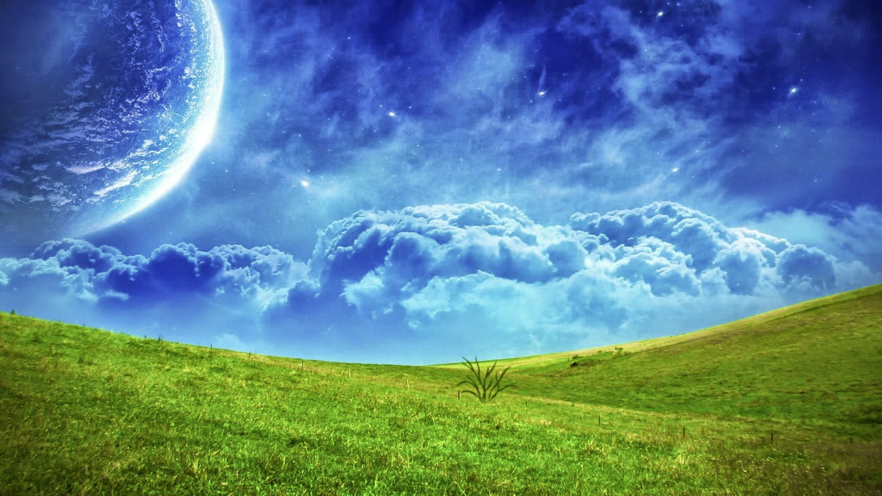
I started with a fairly simple image:


The original image is very bright and cheerful. Lets see if changing the colour can change the overall mood of the image.


 Changing the colour to a deep orange gives the image a feeling of foreboding and unease.


Darkening the orange scene gives the image an increased feeling of danger and unfamiliarity; a big contrast to the original image we started with.


Making the image dark, but more grey-brown than orange, gives the scene a slightly more eerie feel.


 Next, I wanted to try some more subtle colour changes. Here's a reminder of the original image:

 
By keeping the main colours but changing the hue and saturation, the scene was given a slightly colder, harsher feeling, as can be seen below:


============================


Colour has a big effect, but colour alone is not enough. The contents of the scene also need to be adapted to fit the aesthetic. For example, in the more negative-looking scenes, you would most likely want more clouds, and less grass. This further adds to my thought in previous posts, that a scene needs to have a lot of thought behind it, not just one blanket method, even though each aspect has an effect in itself.


I am now going to look into perspective, and will then start drafting the scenes for my artefact, so that I can start getting feedback.

Research - Colours and Lighting - Colour Theory

Colour Theory has many definitions, concepts, and design applications. I am going to start by looking at the following basic categories: the colour wheel, colour harmony, and the context of how colours are used.


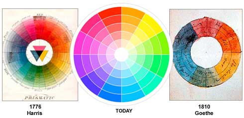
The Colour Wheel:

colormatters.com

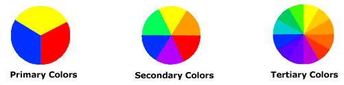
There are different categories of colour, based on the above colour wheel.

colormatters.com


Primary Colours: Red, yellow, and blue. These are the three pigment colours that can't be mixed or formed by combinations of any other colours. These are the three colours that all other colours are derived from.

Secondary Colours: Green, orange, and purple. These are the colours that form as a result of mixing primary colours.

Tertiary Colours: Yellow-orange, red-orange, red-purple, blue-purple, blue-green, and yellow-green. These colours are the combination of a primary colour and a secondary colour. That is why the hue is a two word name.


Colour Harmony:

A harmony is a pleasing arrangement of parts. This can apply to many subjects: music, poetry, colour, etc.

In regards to colours, harmony is something that is visually pleasing. It engages the viewer and it creates an inner sense of order, a balance in the visual experience. If something is not in harmony, it is either dull or chaotic. At one extreme is a visual experience that is so bland that the viewer is not engaged. The human brain will reject under-stimulating information. At the other extreme, is a visual experience that is so overdone, so chaotic that the viewer can't stand to look at it. The human brain rejects what it cannot organise, what it cannot understand. Colour harmony delivers both visual interest and a sense of order.

Extreme visual unity leads to under-stimulation, while extreme complexity leads to over-stimulation. Harmony is a dynamic equilibrium.


Some Basic Formulas for Colour Harmony:

There are many theories for colour harmony, but these are some of the basics:

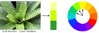
1. A colour scheme based on analogous colours.

colormatters.com

Analogous colours: three adjacent colours on a 12 part colour wheel. There is normally one dominant colour among the three.


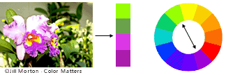
2. A colour scheme based on complementary colours.

colormatters.com

Complementary colours: Colours that are directly opposite each other on the colour wheel, such as red-purple and yellow-green. Opposing colours create maximum contrast and maximum stability.


3. A colour scheme based on nature.

colormatters.com

Nature is a great place to find colour harmony. As seen in the picture above, the three colours (red, yellow, and green) create a balanced design, regardless of whether this combination fits into a technical formula for colour harmony.


Colour Context:

Colour context is a very complex area of colour theory. Colour context is the name given to the way colours behave in relation to other colours and shapes. Different background colours can have a big effect on any one colour, as can be seen below:

colormatters.com

Red seems more brilliant against a black background, and slightly more dull against a white background. Against an orange background, red seems more lifeless, and drowned out; in contrast with the blue-green colour, it exhibits brilliance.


Different Readings of the Same Colour:

colormatters.com

Colours can appear vastly different, just by changing the background colour. In the above image, the small purple rectangle on the left appears to have a red-purple tinge when compared to the small purple rectangle on the right. In reality, they are both the same colour, as evidence by the image below. In this way, three colours can be perceived as four colours.

colormatters.com

Observing the effects colours have on each other is the starting point for understanding the relativity of colour. The relationship of values, saturations and the warmth or coolness of respective hues can cause noticeable differences in out perception of colour.


tigercolor.com
Warm and Cool Colours:


The colour circle can be divided into warm and cool colours.

Warm colours are vivid and energetic, and tend to advance in space.

Cool colours give an impression of calm, and create a soothing impression.


Tints, Shades, and Tones:


Tint: when a colour is made lighter, by adding white.

tigercolor.com


Shade: when a colour is made darker, by adding black.

tigercolor.com


Tone: when gray is added to a colour.

tigercolor.com


The Meanings of Colours:

Colours are often associated with specific emotions. In this section I will explore which emotions are typically connected to which colours. Some colours have different meanings in different countries and cultures, but I will focus mainly on a more generalised scale.


Red:

Red is often seen as a colour of extremes.
Associated with: Love, passion, seduction, violence, danger, anger, adventure.


Yellow:

Yellow is the colour that catches the eye more than most.
Associated with: happiness, optimism, enlightenment, creativity, sunshine, warmth, spring.


Blue:

Blue is a colour that has many meanings, depending on the shade used.

Dark blue is associated with: trust, dignity, intelligence, authority.
Bright blue is associated with: cleanliness, strength, dependability, coolness.
Light (sky) blue is associated with: peace, serenity, ethereal, spiritual, infinity.

Blue can, however, also often be associated with depression, and sadness in American culture. This is a good example of how colour symbolism can evolve in different countries.


Green:

The colour of nature and the environment.
Associated with: growth, rebirth, fertility, nature.


Orange:


Associated with: energy, vitality, cheer, excitement, adventure, warmth, good health.


============================

Now that I have done some colour research, my next task is to actually experiment with colours to see how it affects an image.